People are only just realizing what the iPhone Photos app icon is supposed to be and it's a huge throwback
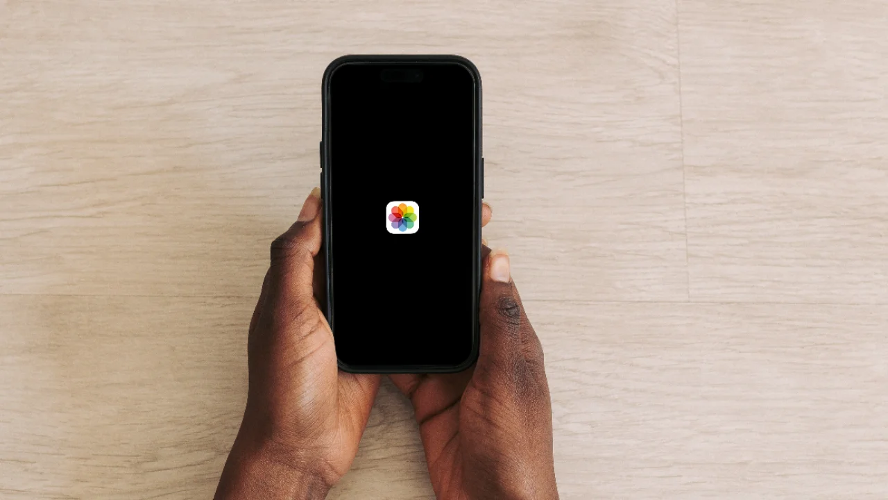
Have you ever looked at the iPhone Photos app icon and wondered what it is supposed to be, because it’s a huge throwback?
For years, millions of iPhone users have tapped the colorful flower without giving it a second thought.
But now, a wave of social media posts has people doing a double-take at one of Apple’s most familiar designs.
And once you see the inspiration behind it, you can’t unsee it.
What is the iPhone Photos app icon supposed to be?
At first glance, the Photos app icon on all your Apple gadgets just looks like a simple, vibrant flower made up of rainbow-colored petals, it’s clean, modern, and very Apple.
But it turns out the design actually traces all the way back to the company’s early days.
Long before iPhones existed, Apple used a literal rainbow in its branding
The classic Apple logo from the late 1970s featured multicolored stripes, which became a defining part of the company’s identity for decades.
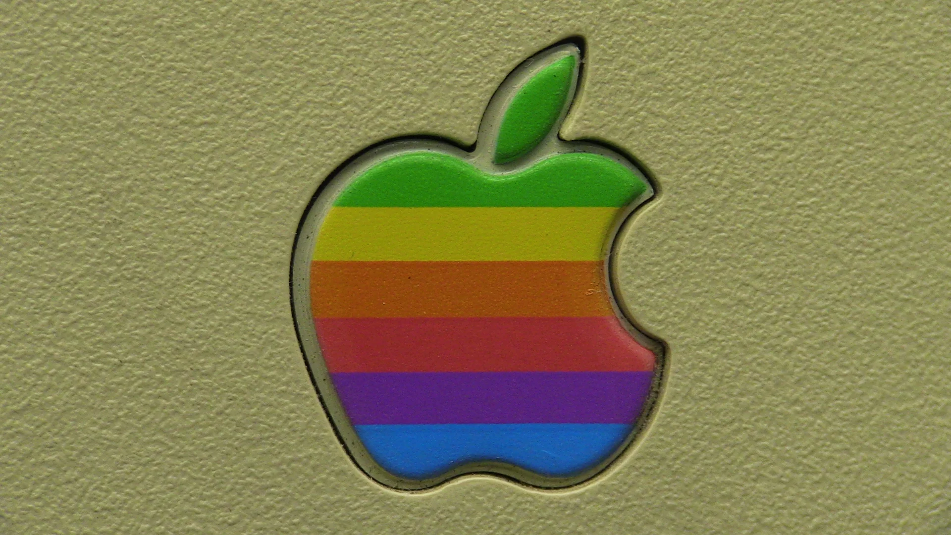
The Photos icon carries that same DNA, using a circular arrangement of colors that echoes the original rainbow palette.
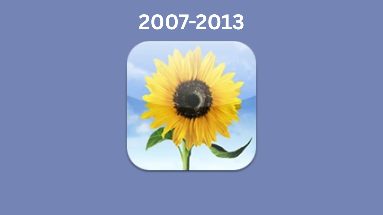
Even more interesting, earlier versions of Apple’s photo software leaned heavily into real imagery.
The original iPhoto app icon featured a bright yellow sunflower, which became instantly recognizable to Mac users.
That sunflower wasn’t random either; it became a bit of a mascot for photography, light, and vivid color and was copied by a few other tech brands.
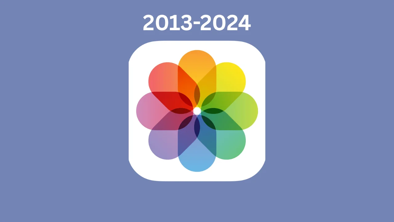
How the Photos app icon evolved from a sunflower into a modern symbol
When Apple transitioned from skeuomorphic design to a flatter, more minimal style, the sunflower had to go, but instead of scrapping the idea entirely, Apple made it slightly more abstract.
The result is the Photos icon we recognize from the last eleven years: a stylized flower made of colored petals arranged in a perfect circle.
It’s essentially a modern, simplified version of that original sunflower, combined with the brand’s iconic rainbow vibes.
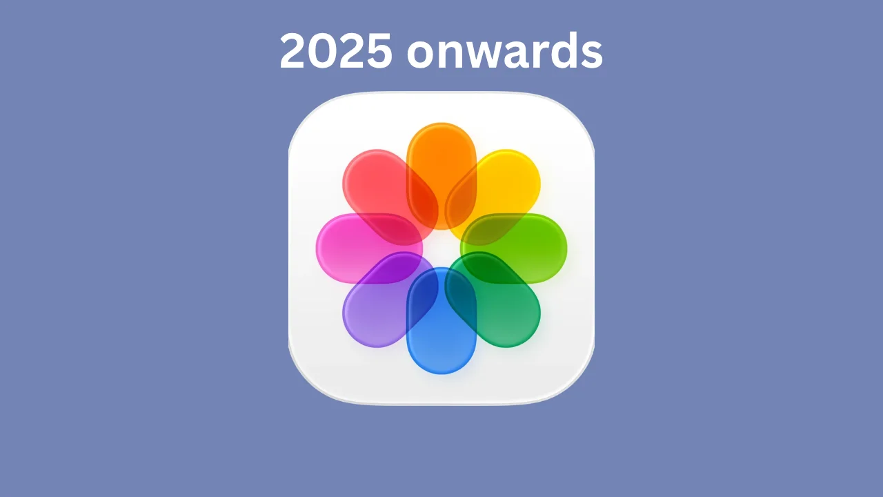
With the newest iOS updates, the rainbow flower has changed a bit, but looks very similar to the minimalistic style we’re used to.
What’s surprising is how many people never made the connection.
Online, users have been reacting with everything from shock to amusement, with some admitting they always thought it was just a random color wheel.
Now that the backstory is out, the logo feels a lot more intentional because it’s not just a pretty design, it’s actually a tribute to Apple’s history, its early software, and even its original logo.
And for the iPhone Photos app that people probably use every single day, that’s a pretty clever piece of design hiding in plain sight.
Follow topics and authors from this story to see more like this in your personalised homepage feed and to receive email updates.